2XU Logo Exploration
When: Spring 2015
Instructor: Victoria Arriola
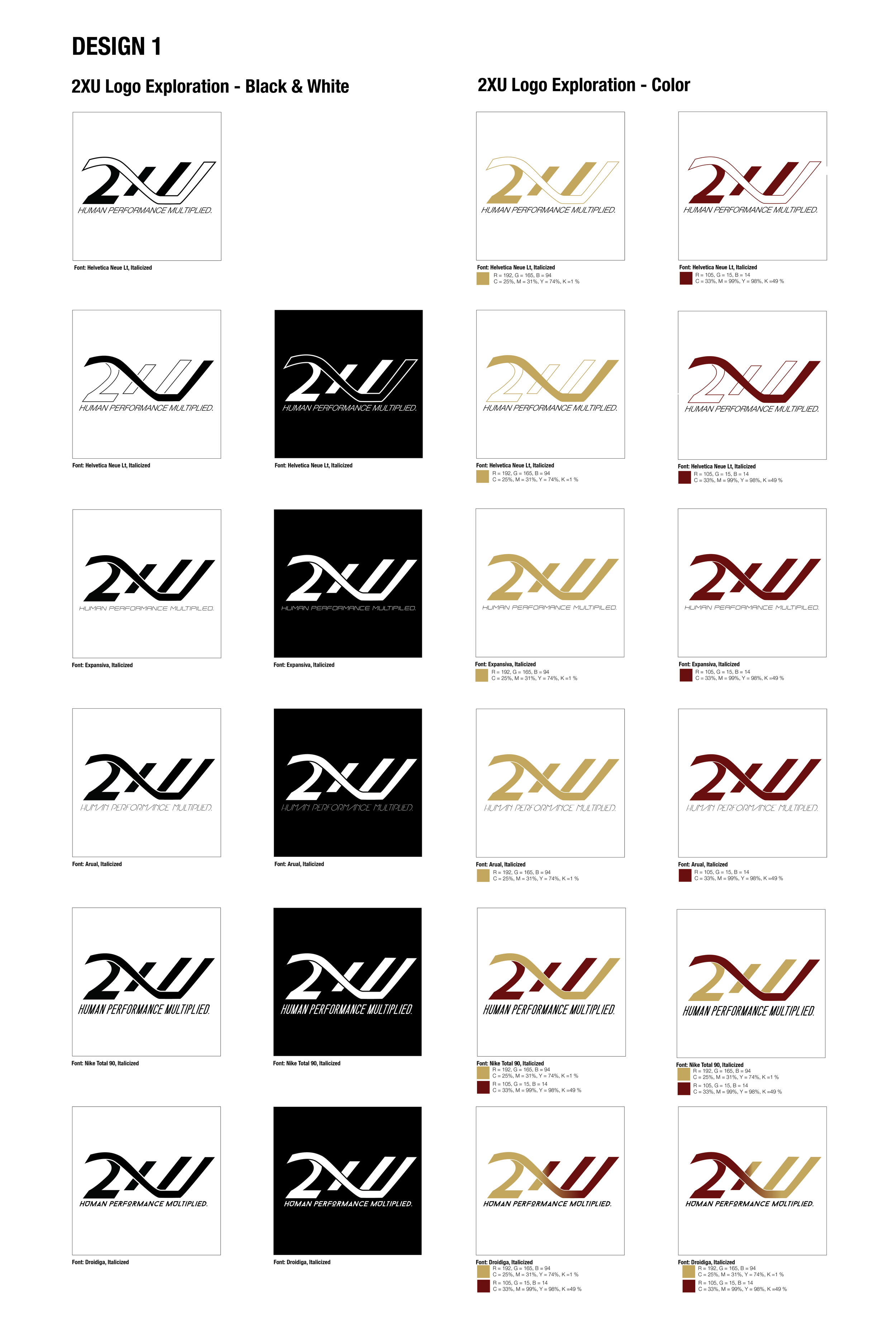
The purpose of this assignment is to update the logo of 2XU to better represent its brand image. The final design is shown below, as long as the logo exploration process.
Brief
2XU, founded and based in Melbourne, Australia, is a technical performance sports brand that aims to create products that advance human performance. 2XU fosters hard work and encompasses a culture that is very motivated in self-achievement and progression.
Color Evaluation
White denotes perfection, wholeness and completion. It also represents stability and creates a sense of calmness and composure. This is a good use of the color white in that it correlates with the brand’s philosophy of producing products help optimize human performance.
Competition
Direct Competitors include SKINS, UnderArmour, and BSC.
Target Audience / Market Placement
2XU targets professional athletes, capable athletes and other fitness enthusiasts that want to increase their performance level. Fit to Win – The key insight is that the consumer, when they are involved in an athletic pursuit, wants to win. It is about beating the other person. Fit to Perform – The key insight is around individual performance and for the consumer to be the best that they can be. Fit to Live – The key insight into this mindset is really around the desire to look good and feel great in equal doses. Fashionability of the garments becomes important.
Logo Refinement
The logo is currently very clean. However, the logo seems to be stretched. It should be slimmer and more modern. In the newly designed logo, the goal is to present 2XU as a sports apparel brand that produces compression gear for individuals that want to better themselves. The brand prides itself as one that promotes progression and self-improvement and fosters hard work.
The logo design attempts to produce an exciting feeling and sense of self-worth and potential.
Based on 2XU’s competition, brands such as UnderArmour, Nike and Skins have transitioned into a single iconic logo. The potential logo designs for 2XU explores the option of having the “X” become the icon of 2XU, with potentially removing “2” and “U” altogether.
Final Design
Execution
Sporting Bags
Packaging
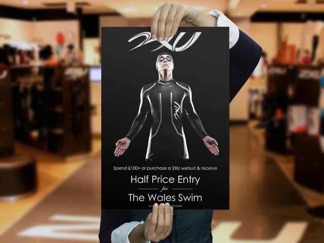
Signage
Apparel


